Package Design and Brand Identity: 38 Case Studies of Strategic Imagery for the Marketplace
A Visual Journey Through Corporate Identity and Packaging Design from the 1980s and 1990s
A few decades ago, I found myself on a message board for Transformers fans. In one of the threads, someone mentioned a book that had a two-page spread featuring the iconic packaging of the Transformers toys from Hasbro. The book was called Package Design and Brand Identity: 38 Case Studies of Strategic Imagery for the Marketplace, and I knew right then that I wanted a copy for myself. After a bit of a hunt, I finally tracked down a copy online, in excellent condition, and I didn’t hesitate to order it. I’m so glad I did—not only does this book feature one of my favorite toys, but it captures a unique moment in time during the '80s and '90s when beloved brands were being reimagined and exciting new products were bursting onto the market.
What is this book?
Package Design and Brand Identity is a collection of 38 case studies that showcase the creative process behind corporate identity and packaging design. These designs were developed by the communications and design firm Coleman, LiPuma, Segal & Morrill, Inc. (CLS&M). The book is primarily visual, illustrating how the firm approached their projects, blending traditional design techniques with the then-cutting-edge technology of computer graphics. We get a fascinating glimpse into an era when design was evolving rapidly—CLS&M wasn’t just designing products; they were helping to shape the visual language of consumer culture.
At its core, the book is a bit of a portfolio—a showcase of the firm’s work with high-profile clients and the impact they made on large-scale marketing campaigns. This is the type of book you’d hand to a prospective client to say, “Look what we can do.” While it primarily focuses on the visual impact of the brands, the first few pages provide insight into CLS&M's research methodology and design philosophy. Admittedly, I initially skipped this section when I first got the book, opting to dive straight into the glossy photo spreads, but in hindsight, it’s worth reading. These pages highlight the complexities behind designing effective packaging and how success is measured, offering a thoughtful perspective that deepens your appreciation for the visuals that follow.
What’s in this book?
As mentioned, the book includes 38 case studies of both well-known and more niche products. Each study spans 2–6 pages, featuring vibrant images of packaging, shelf displays, branding materials, and the occasional behind-the-scenes glimpse of the design process. What’s striking is the sheer variety, not only in the products but in the design approaches—CLS&M’s ability to tailor their work to different markets and aesthetics is on full display. Here are a few of the standouts:
Nestle Sweet Success
Sweet Success was a weight-loss product from Nestle, focused primarily on chocolate beverages. This case study gives us a behind-the-scenes look at their packaging development, from early rough sketches to the final product shot, which is beautifully staged.
One of the standout images is of the logo being rendered on a computer—this was the early days of digital design. While the shot is clearly staged (with the keyboard awkwardly shoved to the side), it’s still an interesting snapshot of how design technology was starting to change the industry.
Sculptured Pyrex
I didn’t even know Pyrex had a "sculptured" line of products. Learning about this was a revelation, and I’m grateful to the book for introducing me to it.
The design here is minimalist, yet elegant—capturing the simplicity and functionality that Pyrex is known for, while also making the product feel a bit more upscale with its sculptural shapes. This case study highlights how packaging can influence the perceived value of a product.
Ortega Taco
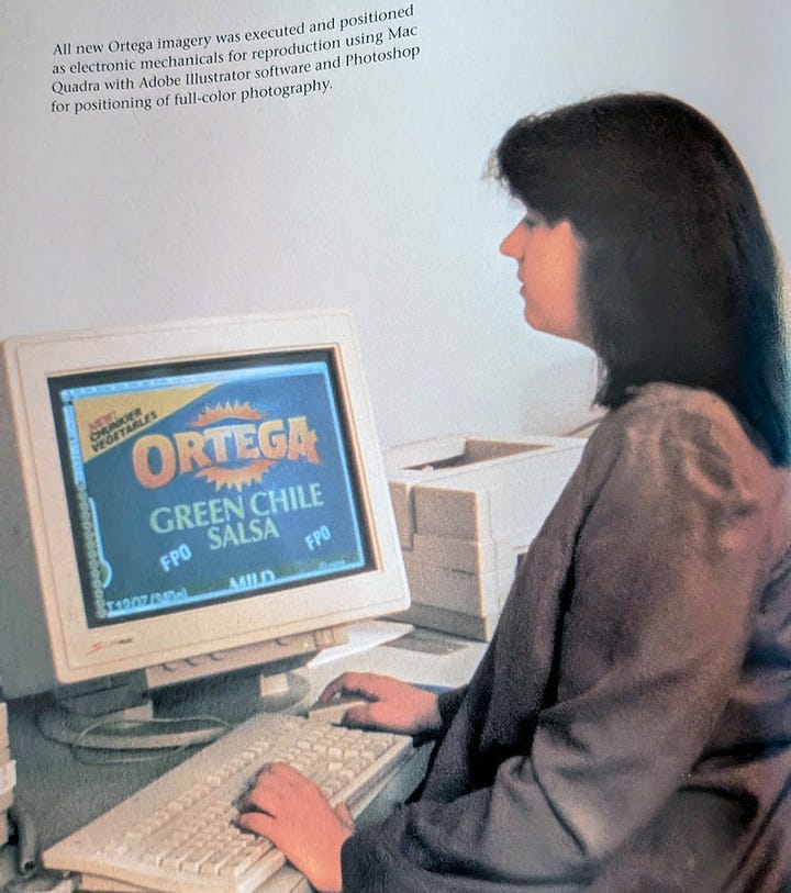
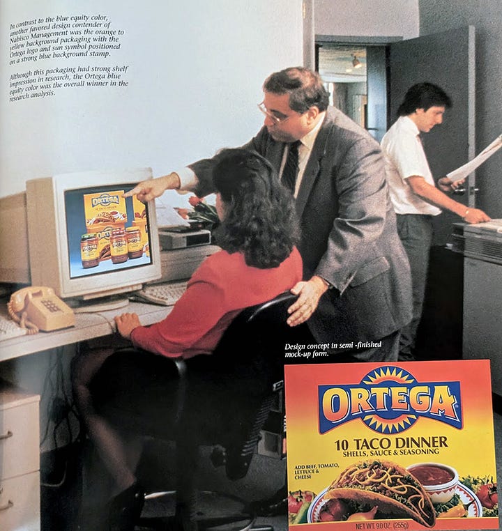
The branding for Ortega is a personal favorite—the case study includes great layouts that demonstrate the playful use of color and typography. There’s also another example of computers entering the design world, with an image of a computer screen displaying early packaging concepts.
We have two photos here. The one on the left, the setup is slightly more realistic here, with the monitor only tilted a bit to improve visibility. With the one on the right, it’s clear that the photo was staged for effect. Not just because of the computer placement, but also the product shot is superimposed onto the screen. Perhaps put there by that very computer?
Konica Cameras
The vibrant rainbow semicircle and confetti background featured in the Konica case study are nostalgic perfection, evoking a youthful, energetic vibe that was clearly meant to appeal to a younger audience at the time.
What I find especially fascinating is the inclusion of the original packaging alongside the updated version. It offers a rare opportunity to compare old versus new and to reflect on the choices made—whether it’s the subtle tweaks or bold changes that shaped how we saw the product. Seeing the Konica Tomato in its original packaging, I think they could have tried to include an image of one on the newer package.
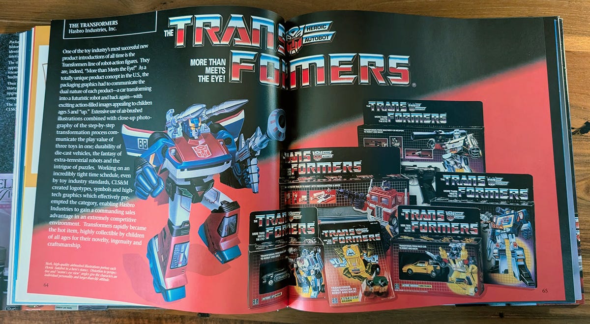
The Transformers
This is the whole reason I initially wanted the book. The two-page spread on Transformers might be brief, but it’s absolutely essential for any fan who grew up with these toys. Seeing the original packaging concepts, alongside the final versions, was like stepping back in time to childhood.
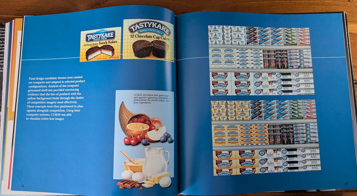
Tastykake
This section was a real surprise, and it has since become my second favorite. I grew up eating Tastykakes, and I vividly remember when the packaging changed. My family wasn’t happy—especially my mom, who much preferred the older design.
The case study includes a shot of the endcaps from the stores in my area, capturing the classic packaging we all loved and the updated version.
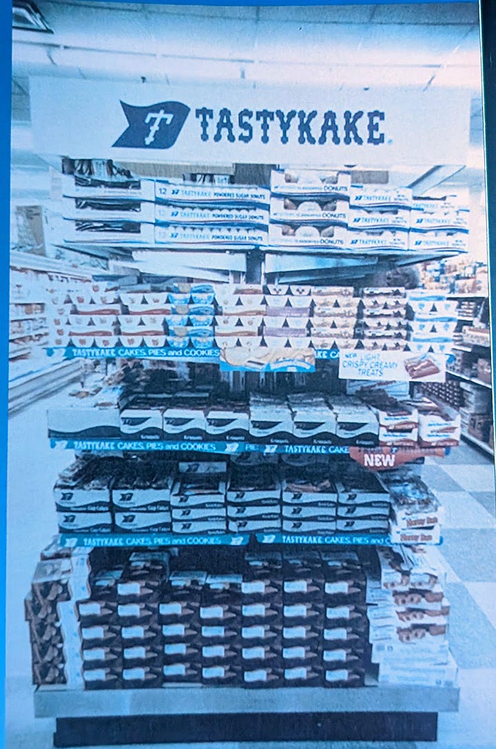
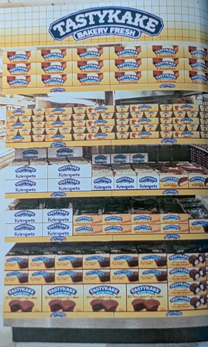
The newer look is warmer and cozier, something you might associate more with baked goods, but the retro styling of the original still makes me nostalgic. Even today, I find myself wishing they’d revert to that simpler, more familiar design.
Pritikin
There are so many gems in this book, but one that really stands out is their work on Pritikin for Quaker Oats. The goal was to create a healthy food line that would jump off the shelves, but for some reason, I never encountered this product in stores. Having it captured here in full color is like discovering a forgotten piece of history.
Why I love this book
That’s the real magic of Package Design and Brand Identity. Each entry feels like a little time capsule—a snapshot of a product that you might have used or at least encountered in passing. Packaging and shelving are ephemeral; they change so frequently that we often don’t notice them unless we stop and take a closer look. CLS&M has essentially created a yearbook of products, allowing us to appreciate the thought and care that went into something as seemingly simple as a box on a shelf. It’s both beautiful to look at and surprisingly thought-provoking.
While the book was probably conceived as a sales tool, I wish more companies put this level of love and craftsmanship into their promotional materials. If they did, I’d probably have a whole library of books like this one on my shelf.
Unfortunately, this book isn’t easy to come by. You might stumble across it online occasionally, but I don’t think too many were printed. So, if you have an interest in product design and you happen to see it at a reasonable price, don’t hesitate—scoop it up. It’s not only a great coffee table book, but also a wonderful conversation starter for anyone who shares a passion for design or nostalgia.



I remember Tastykakes having like a wax paper wrapper once upon a time, at least for the Krimpets. Tastykakes are a product that really suffered in quality as they became nationally distributed. However, if people never had them when they were still a regional brand, then they wouldn’t know what they were missing.
What a gem to have found!