

Which Jaws book cover was better?

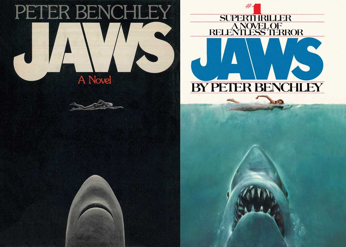
When I was a kid, I remember rummaging around in the basement of our home and finding a dog-eared Bantam paperback copy of Jaws. I had not yet seen the movie, but I was curious and the cover was terrifyingly evocative. So I snuck it upstairs to read late at night when everyone was asleep.
Every night after reading a few pages, I would stare at the cover. This book cover would define Jaws for me and it is nothing short of iconic.
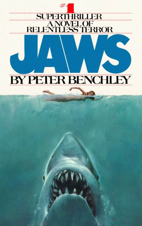
The art for the paperback edition was done by Robert Kastel. Star Wars fans might know Kastel’s name as well, he did the poster for The Empire Strikes Back.
The Jaws art was so good that they would use it for the actual movie poster. Here is a fun fact, the original art for the poster disappeared in the Seventies and has yet to be recovered. It is probably squirreled away, waiting to be rediscovered and what a story that will be when it happens.
I love that cover, but recently my original copy of the book, the same one from the basement, got to the point where it was unusable and I decided to replace it. While doing so, I ordered a copy of the original hardcover with its black & white dust jacket and cover.
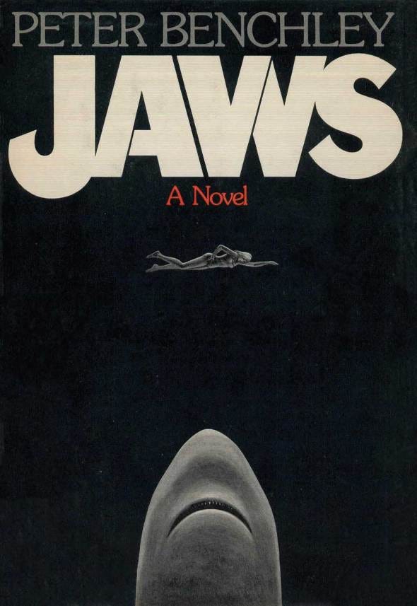
I may love that paperback cover, but night after night of staring at this dust jacket has won me over to its design. It is simple and understated, bordering on abstract, but something about the absolute darkness of the background, the ghostly shark with tiny teeth about to attack the spectral swimmer, and the slashes in the font have won me over.
This cover was designed by a legend of the book cover design industry, Paul Bacon. Bacon designed some of the most recognizable book covers of the 20th century, including Catch-22, One Flew Over The Cuckoo’s Nest, Slaughterhouse-Five, and Jaws.
With such a talented artist behind the cover, I am surprised that they ever tried something different. But I am glad they did. Not only do I own the amazing original cover by Bacon, but the world also got the Kastel version.
While Kastel’s version will always be near and dear to my heart, Bacon’s version has captured my imagination and I think it will be the version of Jaws I reach for year after year moving forward.
They thought the Bacon shark was too penis-like. The slashed font was already in place. The Kastel version is so much better IMO because, primarily, it suits the book a lot better and interestingly, portends the way the film would improve on the book.
Check out the UK edition of the paperback. Has the night theme picture too.